iPlay
Play everything,
[ iPod + video ]
everywhere, wireless.
in 2 steps
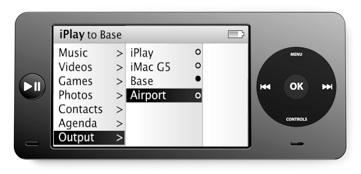
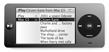
Choose a source.
In this example a movie located on my iMac
Choose a receiver.
In this example a Base (airport video) to which a screen is connected.
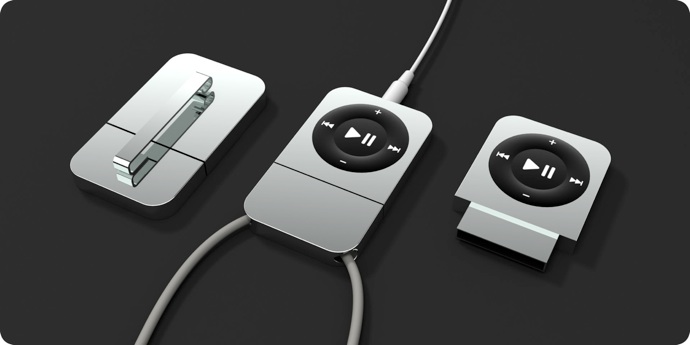
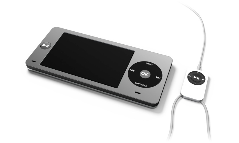
The remote
Clip or necklace version.
It recharges on USB and acts as a wireless receiver so you can plug your earphones in it and forget your iPlay deep inside your bag.
The base
Connected to your TV and HiFi,
the Base is where iPlay rests and recharges.
It is also a wireless relay so you can send through it movies to watch on your TV
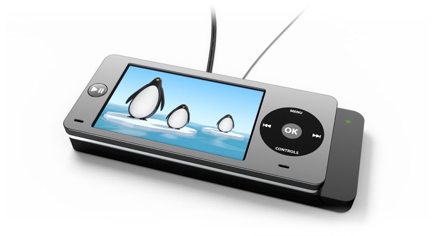
Your computer declares the resources it can broadcast : movies, music, pictures that can be local or on the internet. With iPlay you select and download them to play on the go or you can use it as a remote and send these resources to a diffuser like a TV or the Base.
How
it works
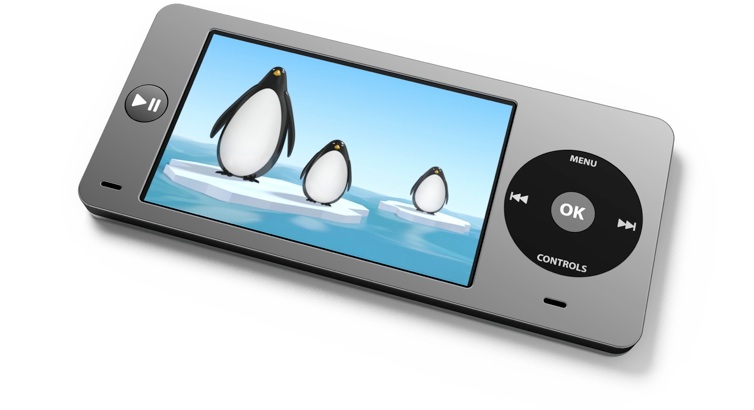
The play button is now on the left, at a perfect place when iPlay is held with two hands.
It is also a great advance in playability for games.
Nonetheless iPlay can entirely be operated with one hand thanks to the click wheel.
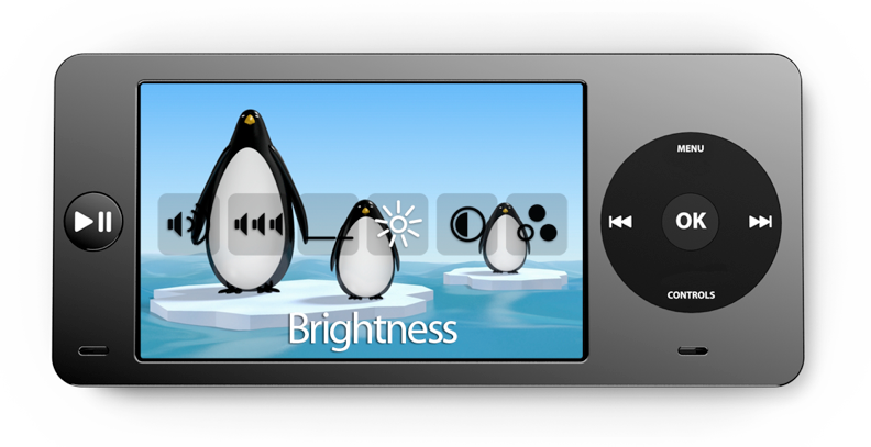
A new “shuffle all’ menu allow to shuffle all the songs in a folder with a single click on OK.
A new “controls” button on the click wheel displays an on-screen menu to access frequently used adjustment such as volume, brightness, languages, subtitles, etc.
Controls


A wireless configuration


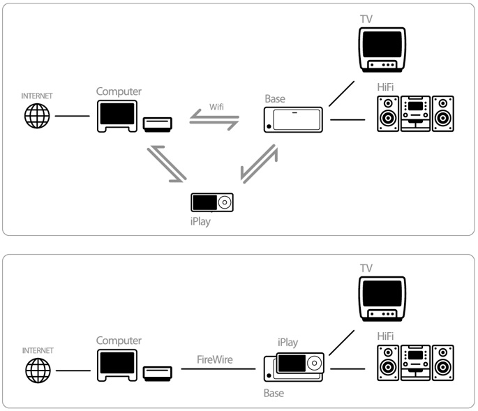
A FireWire configuration
iPlay is the first attempt I did at designing an interface for a device, in september 2005 a month before the introduction of the black iPod.
It began when I asked myself what would look like an iPod with video and how to interact with it.
In the Apple way of doing things I tried to add the minimum amount of complexity. I decided to add a button comparatively to the iPod : the Play (Shuffle) button that I moved from the wheel to the left of the screen.
At its place on the scrollwheel I put a new function : “controls” wich hide a lot of complexity by calling a new interface on screen. The benefit : One button, many functions explicitly displayed on screen.
I think it’s a better way to propose multiple functions than the behavior of the center button of the scrollwheel on an iPod today.
The Play button on the left is not a necessity and it could have been removed entirely but I though it would allow to play games with much more possibilities and pleasure.
Without it, it would be only one more “blind” click to launch a shuffle play with the “shuffle all” menu.
All in all it was a lot of fun to do and it opens me the door of the captivating world of UI design but as you know two years later came the iPhone which makes this design looks like from the stone age...